Analysis of the top 4 wind power adverts of 2015
At the beginning of any great advert, there is always a unique visual sensibly connected to the company’s message. We have picked a handful of wind power print ads with a great design that create a positive impression of the advertiser. Here are the best ads of 2015.
Blade Dynamics
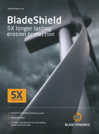
We love distinctive-looking turbine visuals, because we know how hard it is to generate them. In this advert, Blade Dynamics’ image isn’t just stunning, it also sends the right signal: that of blades that are decisively strong and agile in harsh weather. It creates a perception of force and resistance.
Against the handsome backdrop, the headline “BladeShield. 5X longer lasting erosion protection” projects a powerful, product feature-focussed message. The image and the headline are a compelling combination, leading the reader to absorb the value proposition easily. The heavy and large font size used for the headline projects extra power. The ad is vivid and the copy is short and descriptive.
Thanks to the smart and elegant use of the company’s yellow brand colour, the final execution has a richness that breaks through its otherwise fairly monochromatic tone.
Well done, Blade Dynamics, for this ad that screams POWER!

Nordex
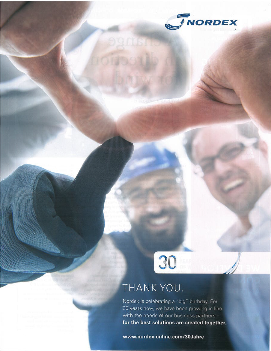
Nordex (once again) breaks through the clutter of corporate OeM ads to offer us fresh and original artwork. The unique image created for the ad shows 3 people and their thumbs-up forming the shape of a turbine. Can it get any smarter? The design quality of the main visual is brilliant both in terms of lighting, framing and composition.
This very optimistic visual conveys a sense of teamwork, happiness and professionalism that one can practically feel. This helps project Nordex as a reliable and pleasant partner to work with. The headline goes on to offer a straight-forward “THANK YOU” that underpins the modesty of Nordex’s approach.
What’s more, the artwork is able to generate very positive feelings without being cheesy, which is no small feat. With this advert, the company actually manages to capture the celebration of the happy and proud moment that a 30-year anniversary often represents.
Good work Nordex!
Siemens
This Siemens advert is a good (albeit short-lived) departure from the very serious (if not bland) advertising design style that we have been getting from Siemens for the past few years.
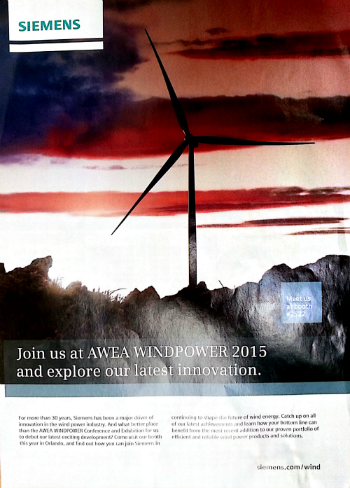
At the heart of this execution is a simple yet powerful idea: clouds can look like just about anything, including an American flag. And let’s be honest, nothing is more peaceful than a glorious sunset. Siemens’ well-crafted, smart and colourful visual is a pleasure to the eye, and perfectly connected with the purpose of the ad, which is to announce their presence at the most important American wind show in the industry.
The striking image invites us to take a closer look at the headline “Join us at AWEA WINDPOWER 2015” which is well in line with the visual. On the other hand, the headline fails to motivate the viewer to continue reading the copy, resulting in a wasted quarter page of advertising opportunity.
This being said, the ad remains a great example of how creativity can efficiently serve brand-building (even if you don't need it much)!
The Switch
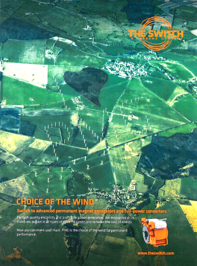
Here is one smart, exotic and intriguing ad. The Switch’s creative team continues to amaze by its ability to maintain high design standards throughout the years. First impressions are everything in advertising: 2015’s prowess? They have found a clever way to actually merge the image and the company’s mantra “I Love PMG” into one integrated and well-crafted image. Great thinking.
The full-bleed green visual catches the reader’s eye, and the interesting colour palate and brilliant design come together to create a fantastic eye-catching execution for The Switch.
This is what we call creativity.


