Analysis of 5 great renewable energy adverts of the year 2014

In an effort to encourage creativity, best practice, and results in renewable energy advertising, we have had a good look at the print ads published in recent copies of mainstream trade publications, and highlighted 5 good creatives that stand out of the pack of often too dull corporate advertisement artworks. Here are the winners!
Aerodyn’s floating turbine advert
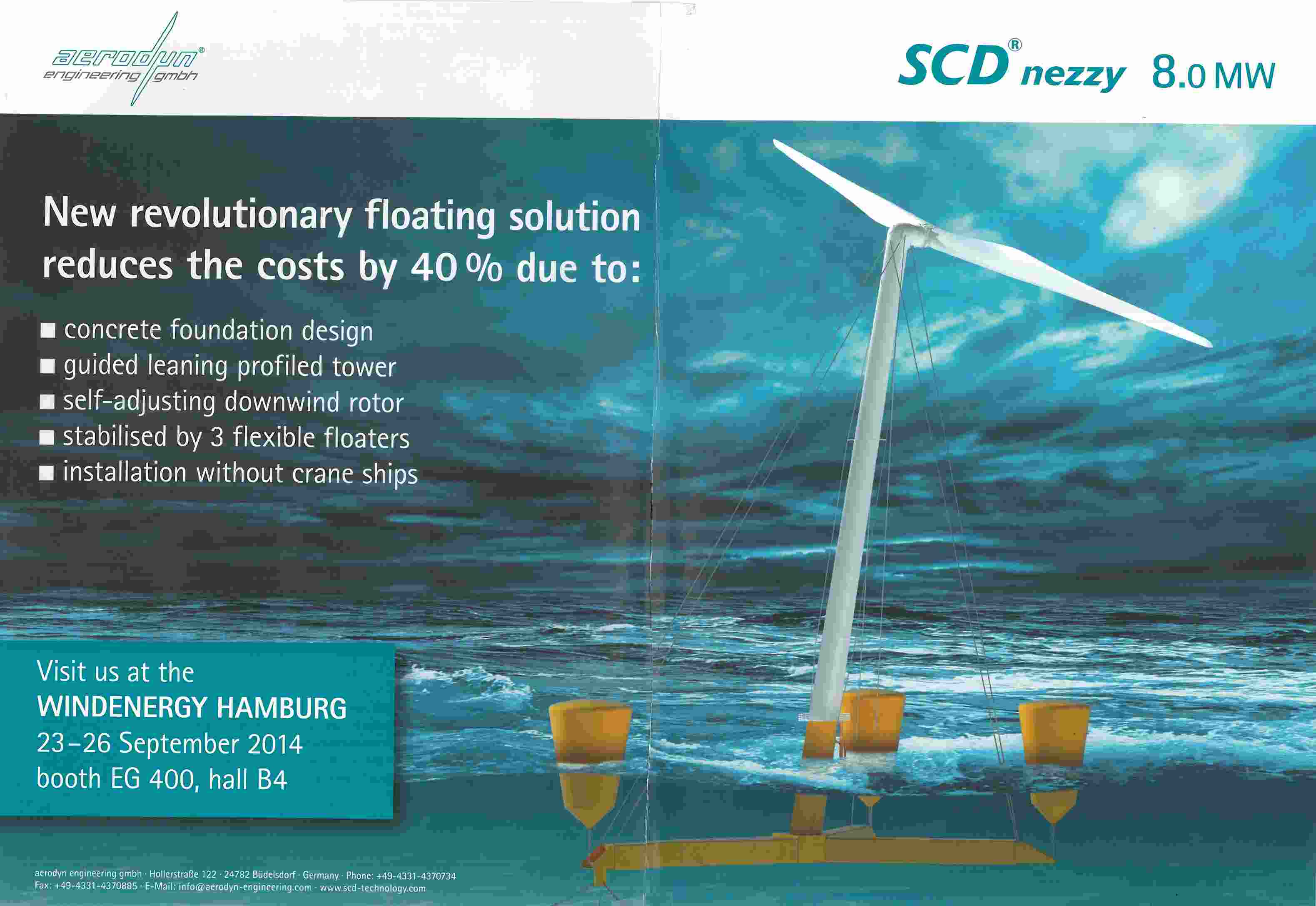
Why we liked it: Aerodyn launched its new turbine in a big way this year, along with bold performance claims (40% cost reduction). Their advertising had to match the company’s ambitions: Aerodyn cleverly chose to adopt a double-spread ad format for its advert, making sure it couldn’t go un-noticed. Visual magnetism is the critical first step en route to engagement. Aerodyn’s 3D impression of its turbine is superb and makes for a vivid, clutter-busting ad. The visual appeal works: the imagery is irresistible. What’s more, we know that successful advertising makes the business case quickly and succinctly, especially at a time when audiences scan through everything in diagonal. In this advert, the product reward is well stated in the heavy headline “New revolutionary floating solution reduces cost by 40%”, and goes on to explain the product features in a straightforward manner. This is a job well done. It caught our attention AND got the message through.
Schmid’s “Silver-plated Landmarks” advert
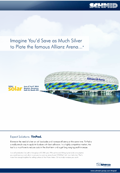
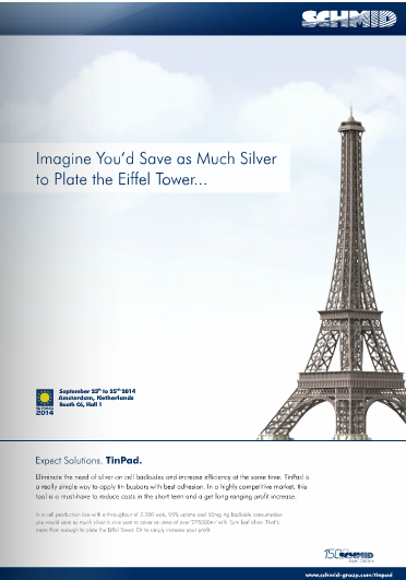
Why we liked it: The idea that Europe’s landmarks could be plated with the silver saved thanks to Schmid may seem quite preposterous to many, and yet, in this case the borrowed interest works because the image is directly tied to the headline, and not just about pure visual appeal. In this kind of exercise, the headline is critical because it must be able to immediately translate the metaphor: The most well-crafted message will go to waste if the audience is delayed long enough to at least consider a key value proposition. Here the bold headline encompasses the main selling point, and coupled with the image, it demands that the readers take a closer look, which we did. Finally, the idea has a nice additional angle to it: In Europe, there sure is no shortage of landmarks to highlight! Schmid has cleverly rolled out that simple yet efficient idea to create a series of ads around the same concept, which creates a powerful recall effect. That way the ads resonate ever more strongly with the audience, and stay fresh during the campaign.
Leitwind’s “Always focused on your needs” Advert
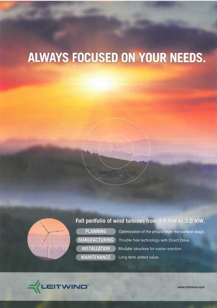
Why we liked it. Well-crafted images reassure readers. For this new ad, Leitwind selected a beautiful and striking full page visual that gently attracts the reader’s eye. Leitwind’s creative team deserves to take a bow for creating an image that’s both dramatic and relevant to the main advertising message. Thankfully we may add, because if it wasn’t the case, the platitude “Always focused on your needs”, which doesn’t say nearly enough, would really fall flat… Yet, because the breakthrough image is apropos of Leitwind’s headline about its commitment to its customers’ needs, in this instance it does enable the ad to penetrate all the noise to engage us further. There is no real text to speak of but the copy is clean, it stands out well on the out-of-focus background, and the company’s business offering is easy to grasp at a glance. All in all, a good use of the reader’s 2 seconds window of attention.
Q Cells advert
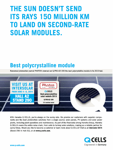
Why we liked it: Stopping readers in their tracks is no easy task for advertisers in ad-crowded solar industry publications, and using humor is always a slippery way to achieve that goal. Bad jokes can backfire in a really nasty fashion. But Q Cells, with its funny and witty headline got it right. It puts a smile on our face and still doesn’t miss the opportunity to pass its “quality” massage forcefully. The deck follows through: “Best polychristalline Module” (we would have added “in the market”), and so does the copy, explaining Qcells/Hanwha’s claim for excellence. Not a bad job at all!
Nordex N117/3000 Turbine Advert
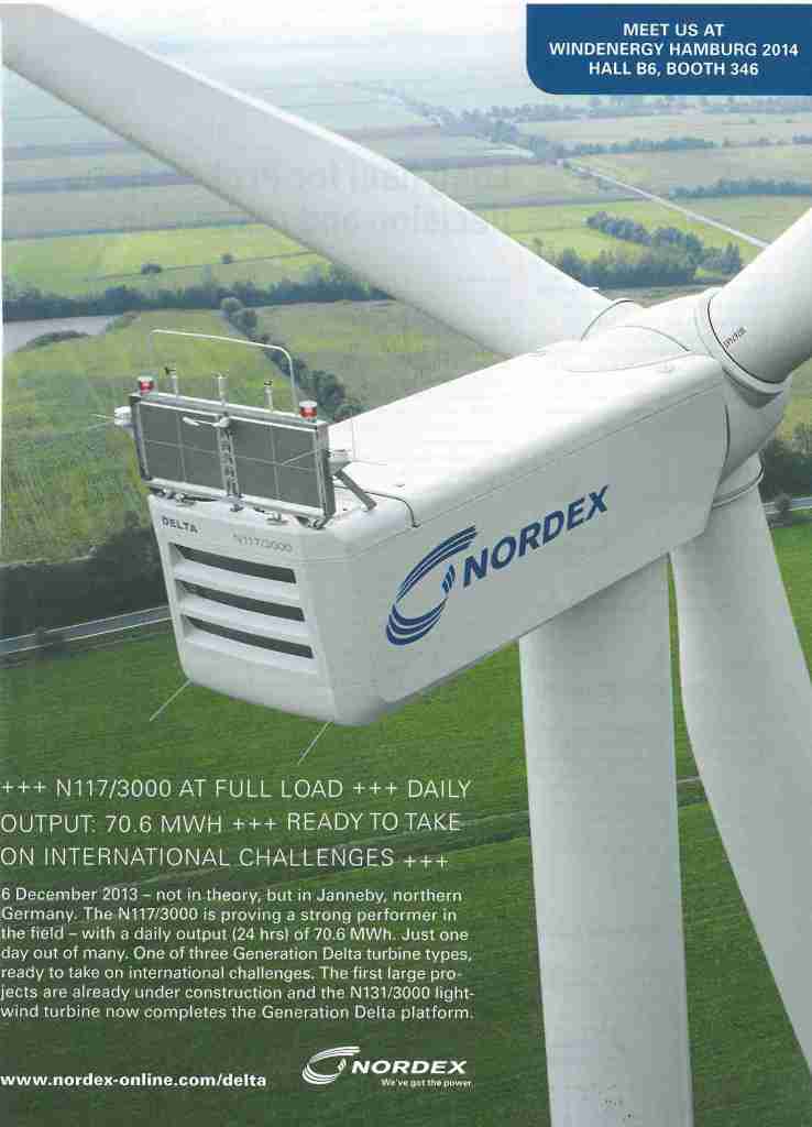
Why we liked it: You don’t need to work with a turbine manufacturer’s marketing team to know how hard it can get to find a picture of your turbine that doesn’t just look like every other turbine image. Nordex’s creative team has understood a long time ago the need to use compelling turbine imagery in their ads to arrest readers for a moment. As usual, they don’t disappoint with this sleek, nicely framed shot of their N117/3000 machine. Its elegant design inspires the notions of craftsmanship and reliability. In addition, the opening line of the copy reads: “Daily output: 70.6 MW/h […] Not in theory, but in Janneby, northern Germany” a strong statement that goes well beyond all the usual spec-sheet-like performance claims we often encounter in average turbine manufacturers’ ads. It validates the claim because it sets it in a real life setting. One negative point to mention though: the absence of a main headline strikes us as a lost opportunity. It certainly reduces the chances that the reader will go on and read the copy.